This page contains Arctic Agency brand material and visual identity guide for advertising and brand communication.
OVERALL
Minimal. Clear. High-end. The visual style of Arctic Agency is polished minimalism. Keep it simple.
DO
- Use a lot of white space
- Use always proper typography
- Use monochromatic colour palette (black, grey, white)
- Use geometric grid layouts
DON’T
- Use colour gradients
- Text effects, drop shadows (especially on logotypes)
- Use too much content on small space
- Use rounding shapes
LOGOTYPES
For print
CMYK PDF
For screen/web
PNG

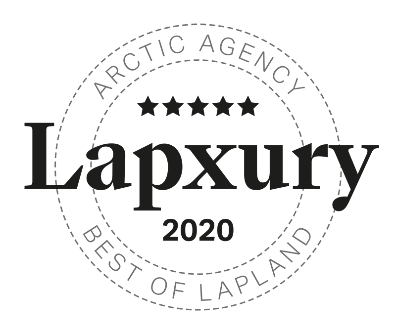
LAPXURY
Slogan / key value proposition. Accompanied by a Lapxury-mark. Mark can be used as a stamp on top of pictures, or as a stand-alone graphic. Use dark or white, depending on the background. Leave ample white space around.
TYPOGRAPHY
GT Sang Bleu Kingdom Bold
ABCDEFGHIJKLMNOPQRSTUVWXYZÄÖabcdefghijklmnopqrstuwxyzäö
1234567890
Grilli Type Sang Bleu Kingdom cuts Bold and Medium. Use in headings, pullquotes.
Aktiv Grotesk
ABCDEFGHIJKLMNOPQRSTUVWXYZÄÖ
abcdefghijklmnopqrstuwxyzäö
1234567890
Main body and sub-headings font is Aktiv Grotesk. Use cuts Medium, Bold, Medium Italics, Bold Italics.
COLORS
Monochromatic. On-screen use slightly (10-20%) tinted blacks and light greys. On print use black and white.
FORM / LAYOUT
Everything is based on a square. Use 1:1 images. Use strict grids.
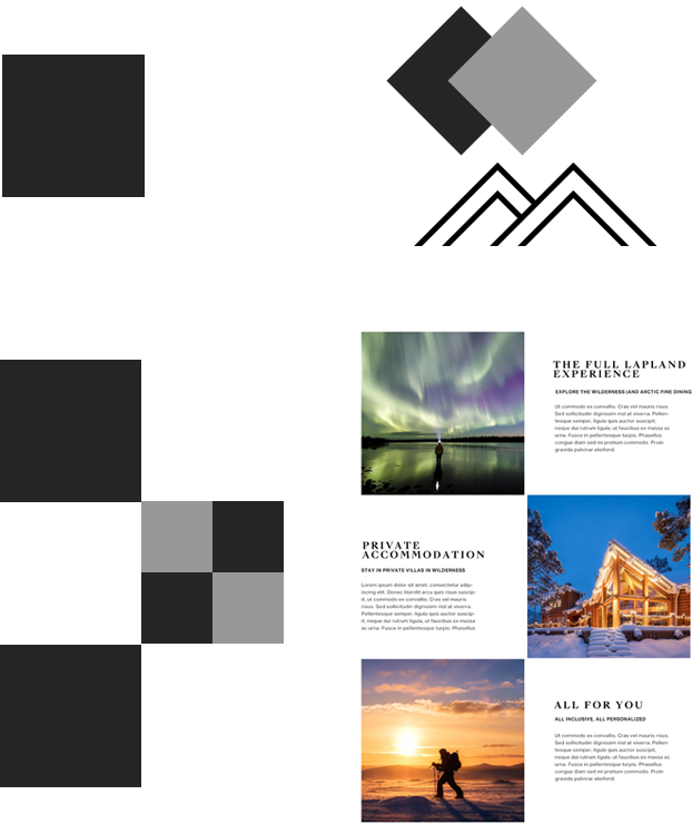
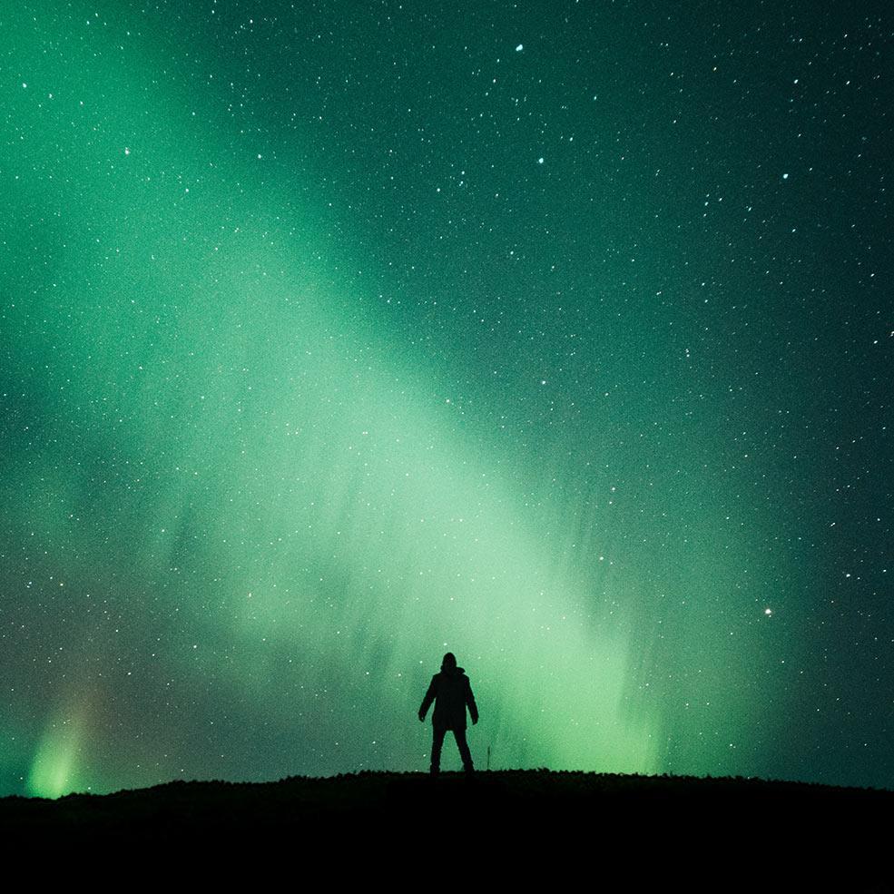
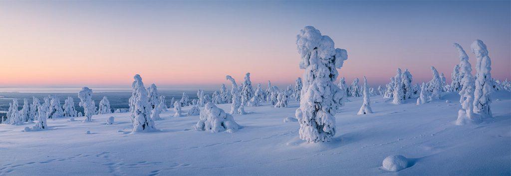
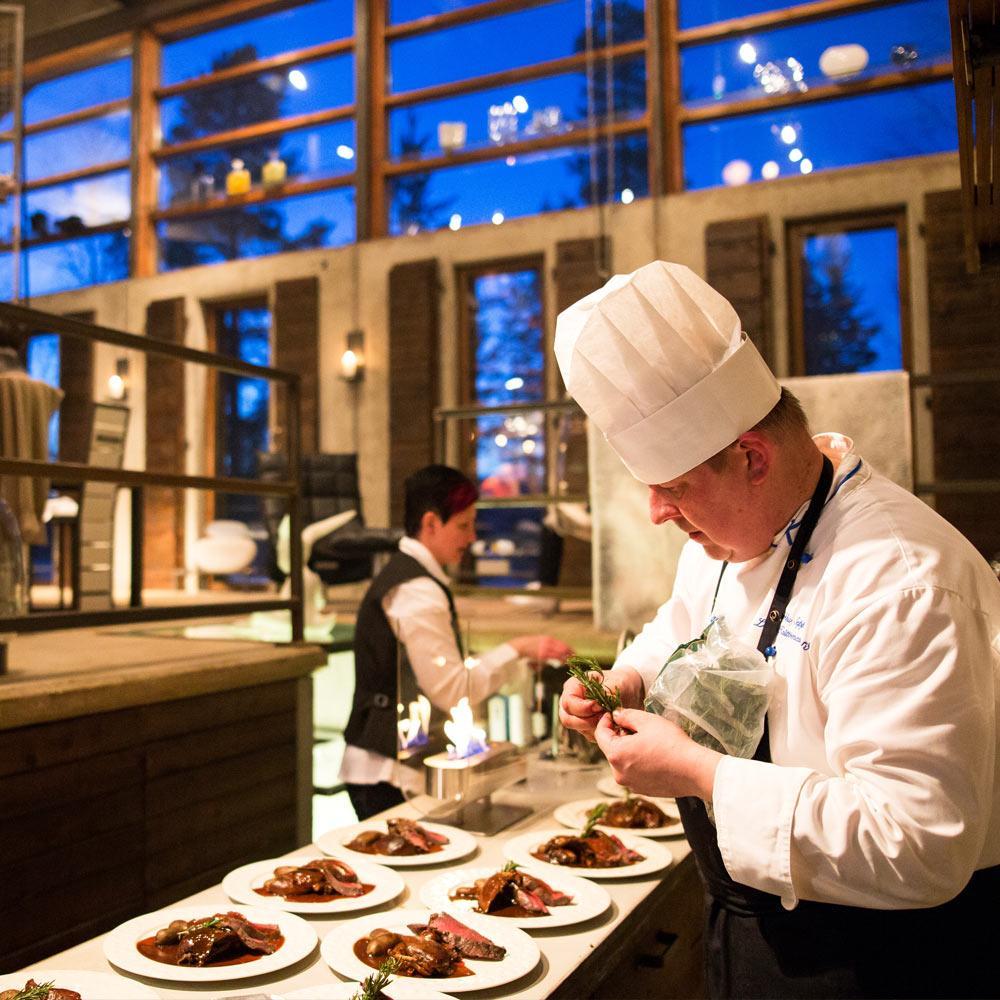
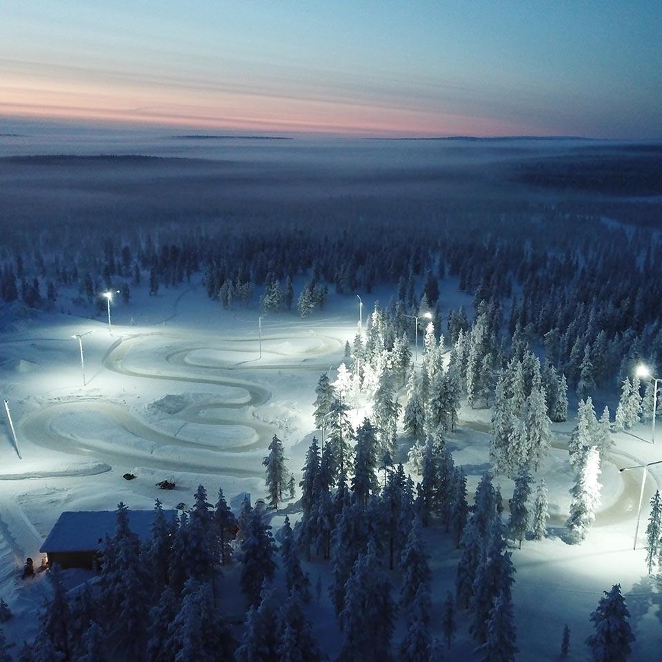
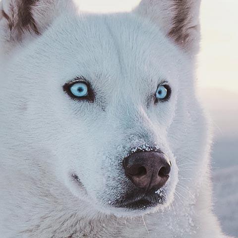
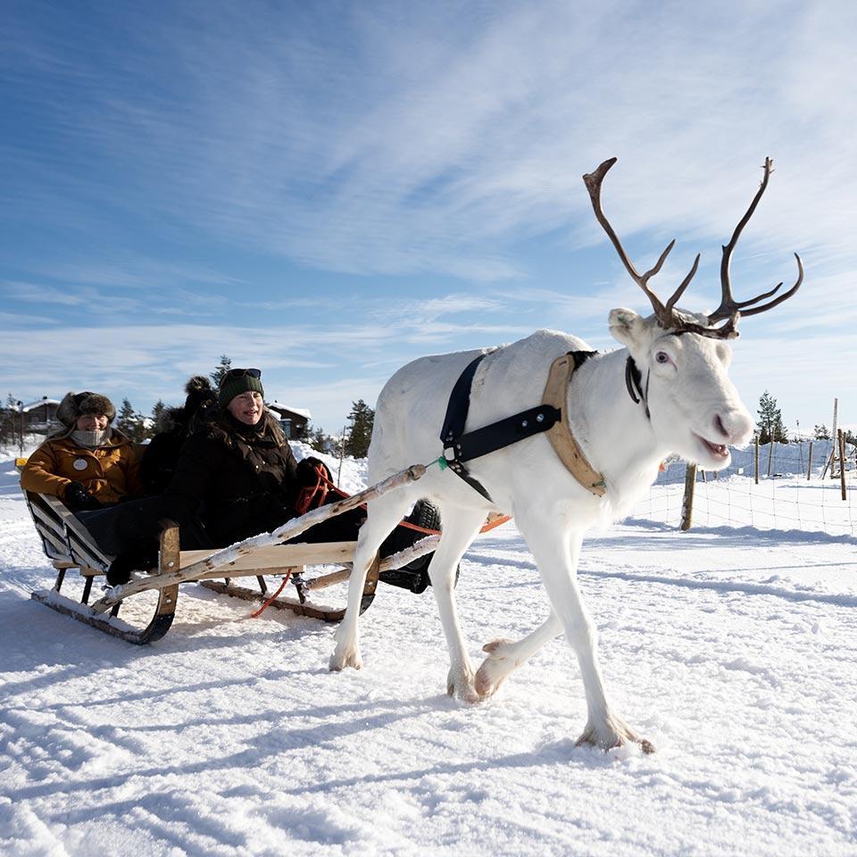
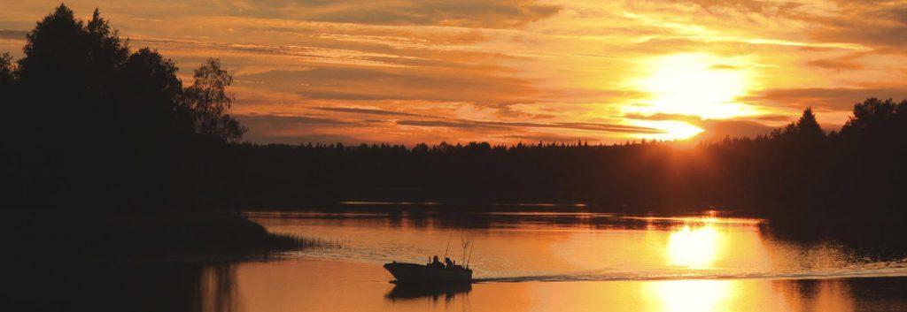
IMAGINERY
High-quality Lapland nature and activities images. Always use professional photographer shots. Never mobile photos, un-edited photos, graphics/decorations, drawings etc.